How to plan a research presentation?
- Parvathi JR
- Mar 3, 2021
- 3 min read
Updated: Nov 9, 2023
Presenting the tips for planning and structuring your research in 15 slides.
From weekly project reports to six-monthly updates, presentations are an integral activity in a researcher's life. Unfortunately, for many researchers, this activity is more stressful than actual research.
Two main mistakes committed by budding researchers and first-time presenters
Clutter each slide with textual content to cover maximum points. This enthusiasm is rarely appreciated by the audience, leaving them bored to their bones as you read the text.
Presentation sides have a dark background with a neon-colored text on it. Remember to avoid heavy content, rainbow colors, random animation, and roller-coaster transitions in slides.
The article would help you to
(i) Master how to incorporate your research in just 15 slides
(ii) Tips on how to keep the audience engaged, and
(iii) Assist you to prepare a reference checklist for presentation
Things to consider before you prepare a presentation:
If the audience is subject experts (research updates/review meeting) - speak jargon
If the audience is a general public (conferences/general address) - keep it simple
If the presentation is for a review meeting, the 1st slide (next to title slide) should list out 'what is achieved' (without going in detail on the method), and the 2nd slide should list out 'what was just done' followed by a detailed update of research activities since the last update meeting.
If it is an oral presentation for a conference or seminar, start with 'why you should hear me for 20 min'. Is the audience going to learn about a new technique/a new approach/tips for troubleshooting/unique solutions?
The structure and content distribution in the slides given below will help to plan your presentation. Based on your content you can add or delete slides.
SLIDE 1
Tip 1: Instead of a standard format detailing the title and present, try to directly address the issue to the audience | What they can expect? | What will they gain out of this presentation?
(Motto: Connect with the audience in the first 1 min)

SLIDE 2
Tip 2: Do add the tenure of the research work on the title page. A researcher who is keen to pursue a similar work will get an idea to their work accordingly
(Motto: Introduction of the researcher)

SLIDE 3
Tip 3: Only cite the most relevant and recent approaches currently available to tackle the problem. Emphasize the knowledge gap to explain why this research is important.
(Motto: Create awareness)

SLIDE 4
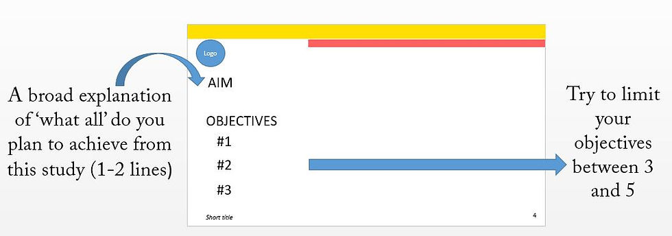
Tip 4: List the objectives and leave the aim for the audience to read. Save time!
(Motto: Research Intent)

SLIDE 5
Tip 5: This slide is very critical, it works as research design map. DO NOT crowd it with too much content.
(Motto: Phase and stages of research)

SLIDE 6
Tip 6: If the entire methodology is split into two or three slides give a hint of the previous phases in the subsequent slides
(Motto: Phase and stages of research)

SLIDE 7-12
Tip 7: Always represent content through figures and tables. Limit text to mention the main result.
(Motto: present result & observations)


SLIDE 13
Tip 8: Instead of the title 'summary', you can display the objectives and outcomes in parallel.
(Motto: Outcome and summary of this work)

SLIDE 14
Tip 9: Reiterate the solution for the audience to remember your research. Don't forget to acknowledge
(Motto: Take home message for the audience)

SLIDE 15
Tip 10: The last slide should contain a virtual that will help the audience to recollect the problem and the importance of your work.
(Motto: A rote-learning approach for memorizing the audience what the work was? and why this work is important?)

CHECK-LIST
Each slide contains: Logo of the institute - Slide number -Short title of the work
Title/Presenter/Guide
Date of Presentation
Why this research?/Current approaches/Knowledge gap
Aim and Objective
Summary (Objective & Output)
Acknowledgment (Funding bodies/People/Services)
Take home message
The numbering of Figures and Tables
Footnotes under figure
Courtesy under figures (wherever required)
References against protocols/findings
The font type and size of the titles in each slide is the same
The font type and size of the content in each slide is the same
Animations are smooth
Hyperlink is working
List of references
All supplementary data after the 'Thank you' slide
Bonus information: How to hyperlink between two slides within a single PPT
1. Click on the text/figure/table (e.g., Phase 1 of slide 5)
2. Press hyperlink (labeled 1)
3. Click on 'Place in the document' (labeled 2)
4. Click on the slide to which you want to link, say slide 17 (labeled 3)
Once you do this, when you click phase 1, it will directly take you to slide 17. If you want to come back to slide 5, repeat the same process with selection to slide 5


Comments